Work
Every business gets its own design
Different layout, different personality, different visual world. No templates, no paint jobs. One live client build so far, and concept studies that show exactly how we think.
Being upfront: SiteFuse is a young studio. The badge on each card tells you what is real client work and what is a concept study, a fully designed scenario for a typical Canberra business. The thinking, the craft, and the standard are identical. Early clients get founding-client pricing for helping us turn concepts into case studies.
All Engraved
Laser Engraving · Personalised Gifts
Live siteRetail and e-commerceShoalhaven NSWAll Engraved
- The problem
- A laser engraving studio with a dormant e-commerce store that looked dated and never rang. Enquiries went to a personal inbox and half were missed.
- The approach
- A custom site with a personality of its own, plus an AI assistant that answers product questions and captures enquiry details around the clock.
- The outcome
- Live and taking enquiries 24/7. The AI front desk qualifies every enquiry before it reaches the owner, so follow-ups happen in minutes, not days.
Visit the live site
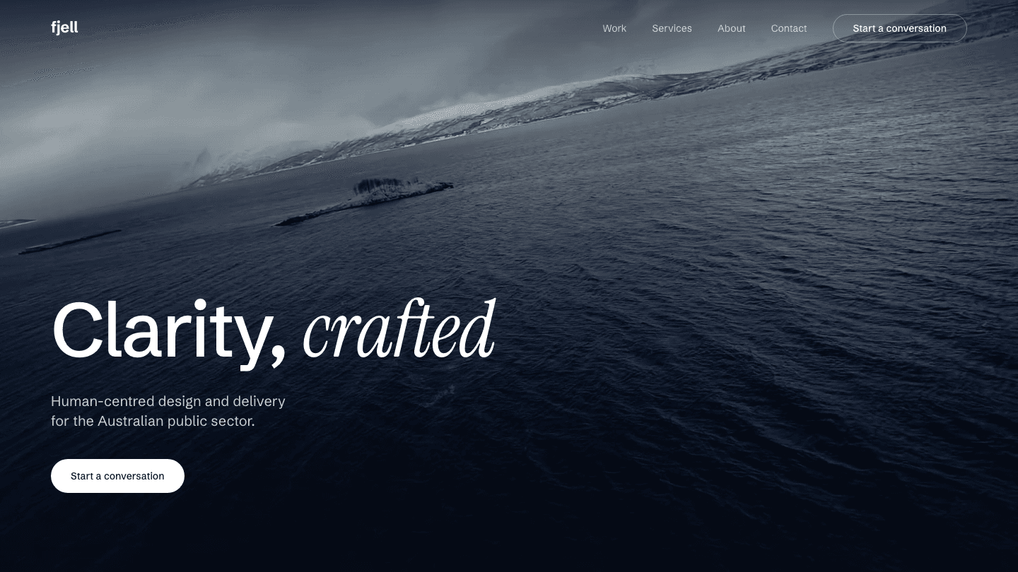 Live siteProfessional servicesCanberra ACT
Fjell Consulting
- The problem
- A human-centred design consultancy working with federal departments. In that market, credibility is judged in one glance, and a template site would quietly argue against premium day rates.
- The approach
- A cinematic brand site: full-bleed Nordic imagery, an editorial serif, a restrained navy palette, and exactly one call to action. Deployed on modern static infrastructure that costs effectively nothing to run.
- The outcome
- Live and working for a consultancy that wins public-sector engagements. Full disclosure: Fjell is the company SiteFuse operates under. Our own shopfront is held to the same standard we sell.
Visit the live site
Two Mills
Espresso Bar · Kingston Foreshore
Concept studyHospitalityKingston ACTTwo Mills Espresso
- The problem
- A neighbourhood cafe living entirely on Instagram. New locals could not find opening hours or the menu on Google, and catering enquiries arrived as DMs that got buried.
- The approach
- A one-scroll site built around the two questions every cafe visitor has: are you open, and what is good today. Menu as fast-loading text, not a blurry PDF, plus a catering enquiry form.
- The outcome
- Designed so the 7am 'cafe near me open now' search lands here, sees the hours, and walks in. Catering enquiries arrive structured with date, headcount, and budget.
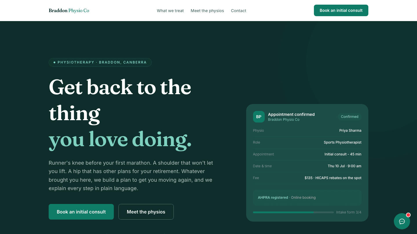 Concept study · fully builtAllied healthBraddon ACT
Braddon Physio Co
- The problem
- A two-practitioner clinic paying $280 a month for a directory listing that showed competitors on the same page. Bookings happened only when reception answered the phone.
- The approach
- A calm, trust-first site: practitioner profiles, transparent session pricing, a runners' specialty section, and an AI front desk for the questions that arrive at 9pm.
- The outcome
- Fully designed and built as a working site you can click through. Lighthouse scores: 96 performance, 100 accessibility, 100 SEO. The 9pm 'physio for runners knee' search becomes a booked consult by morning.
Visit the live site
Volt & Vine
Electrical · Emergency Call-outs · ACT
Concept studyTradesTuggeranong ACTVolt & Vine Electrical
- The problem
- A solo sparkie spending $4,000 a year on marketplace lead credits, competing with three other electricians for every job, and losing the paper trail when the app changed its rules.
- The approach
- A job-focused site: emergency call-out button front and centre, suburb pages for local search, photo proof of real work, and reviews owned on his own Google profile instead of a marketplace account.
- The outcome
- Designed to replace rented leads with owned ones: the site, the reviews, and the pipeline all belong to the business, and the yearly cost is a fraction of the credit spend.
Marlowe & Co
Boutique · Manuka
Concept studyBoutique retailManuka ACTMarlowe & Co
- The problem
- A boutique with beautiful stock and a Shopify template that looked like ten thousand other stores. Nothing about the online experience matched walking into the shop.
- The approach
- An editorial, magazine-feel storefront: large photography, seasonal edits curated like window displays, and a considered checkout. The brand's in-store warmth carried online.
- The outcome
- A store that feels like the shop, built to turn Instagram followers into first-time online buyers and out-of-towners into regulars.
Your business could be the next case study
Founding clients get preferential pricing and a genuinely custom design. Start with a free homepage concept in 48 hours and see for yourself.
Get my free concept